Gallery
Photos of some of my finished room designs and examples of my design boards for inspiration
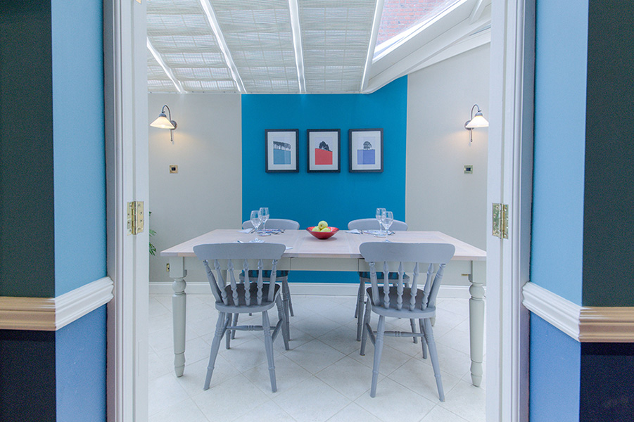
As this conservatory/dining room adjoins a darker end of the kitchen, it was important to keep it as light as possible. Limestone flooring and natural colour blinds which won't fade in sunlight, were used with natural, stone-coloured walls. A simple, painted panel created colour harmony with the adjoining spaces.
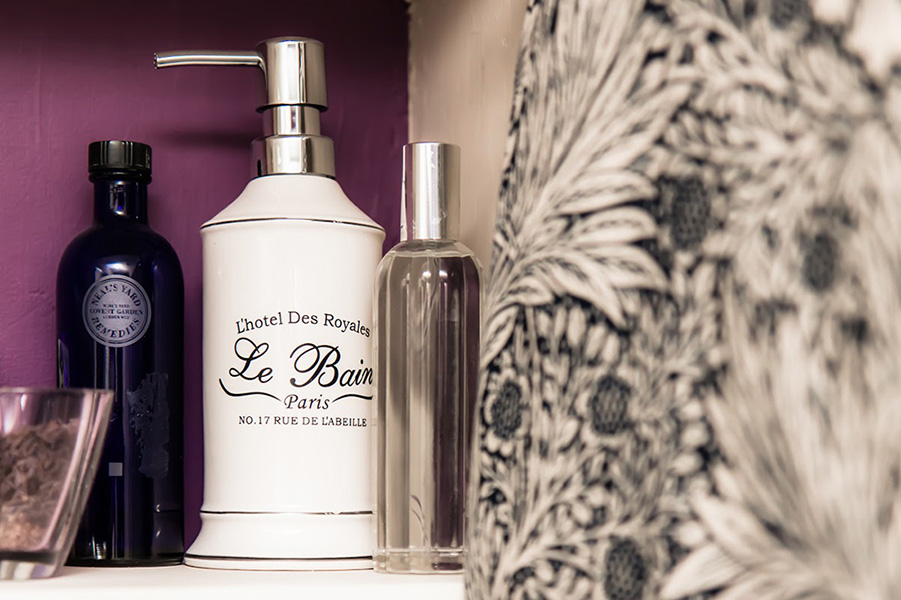
French-influenced downstairs cloakroom. End-to-end fitted mirror was used to increase the feeling of space whilst at either end, the walls were painted a darker colour which also helped to visually adjust the proportions of the room.
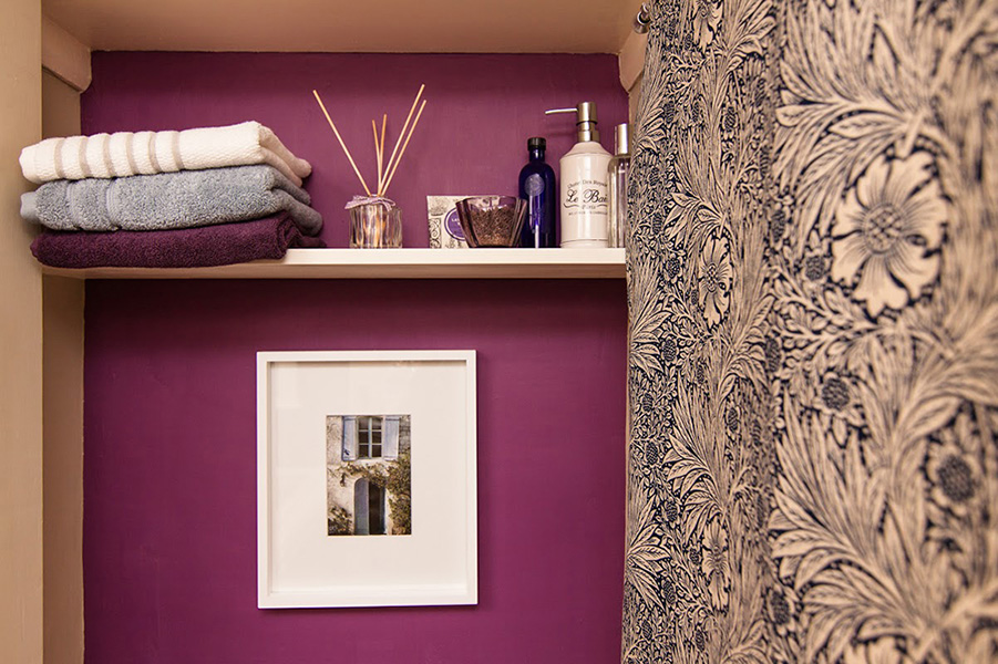
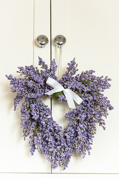
French lavender, blue and fresh white colours used with traditional navy William Morris fabric to compliment the Victorian home setting.
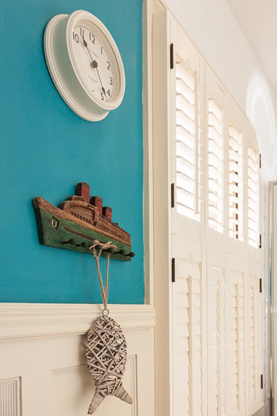 Plantation shutters are an ideal solution in bathrooms, where excess moisture might limit fabric options. They offer a flexible way of bringing in light at different times of the day whilst also giving privacy. These are from https://www.californiashutters.co.uk
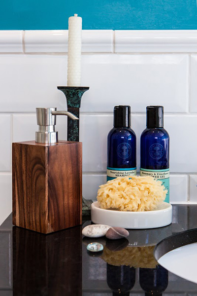
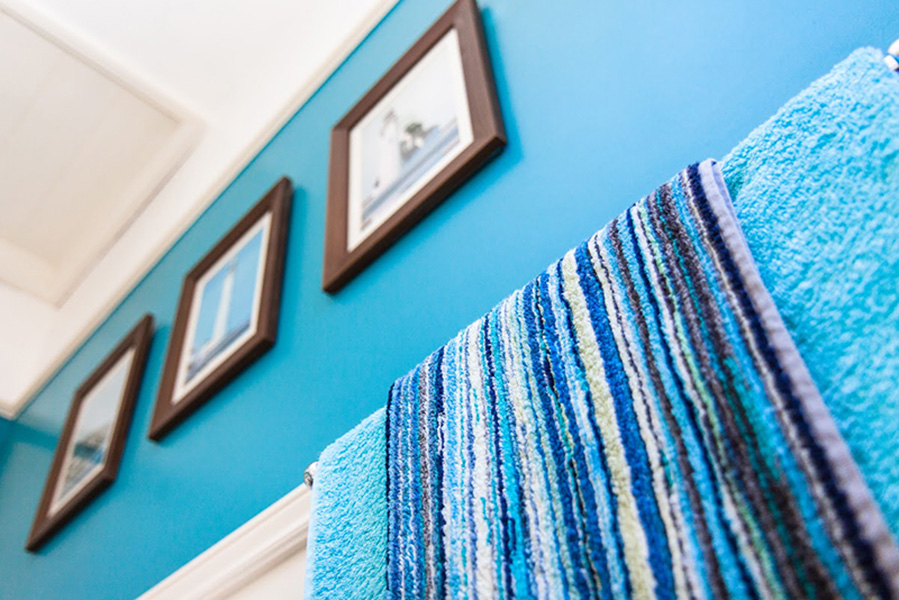
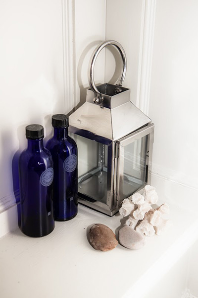
As tiling can be an expensive element in a bathroom, these were kept neutral and light, with contrasting wall colour and textured accessories used to bring in interest. Mixed, natural materials provide a calming environment for relaxation.
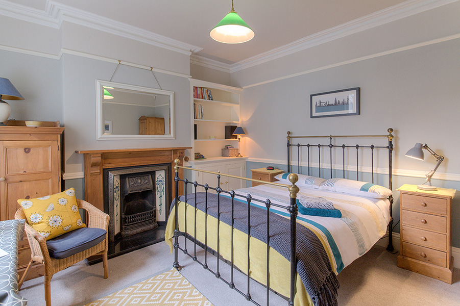
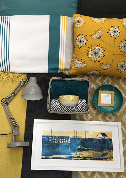
Bedroom making use of existing wooden furniture & fireplace yet given a contemporary touch with geometric designs in teal and grey with an accent of yellow ochre. Mid-Century Modern-influenced dandelion cushion brings together the modern & traditional elements with minimal expense.
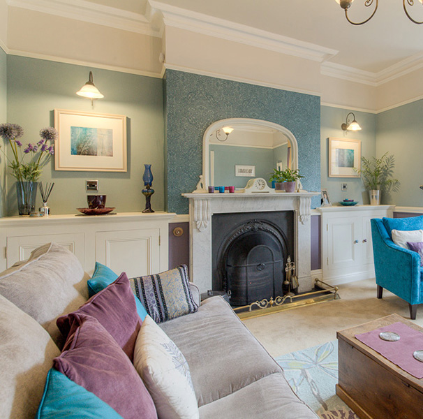
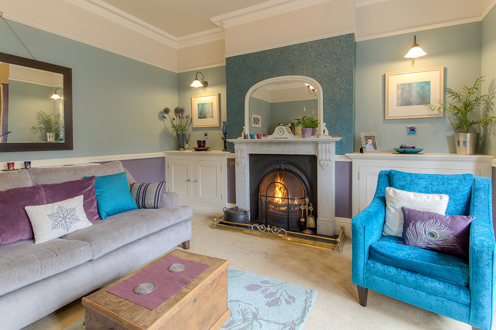
Fitted cabinetry, reproduction fireplace, dado rails & features help to restore the traditional feel but with colourful modern accents creating a Contemporary Classic room. The emphasis is on texture using velvet, silk and embellished accessories. A cost-effective way to bring a feeling of luxury to a room.
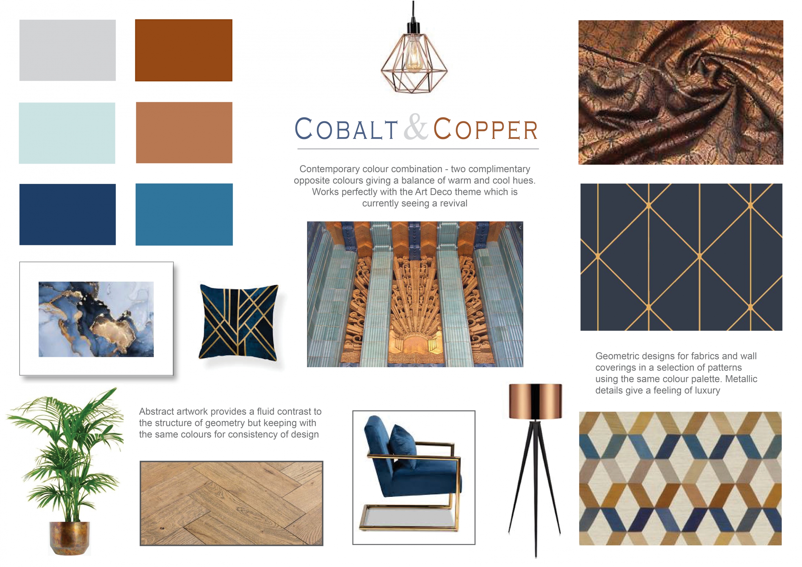
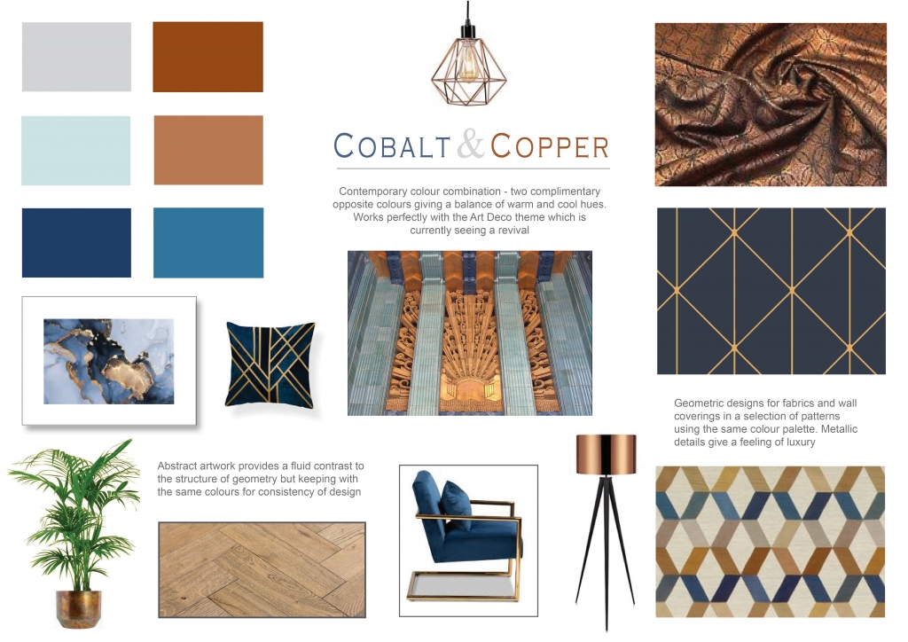
Contemporary colour combination - two complimentary opposite colours giving a balance of warm and cool hues. Works perfectly with the Art Deco style which is currently seeing a revival
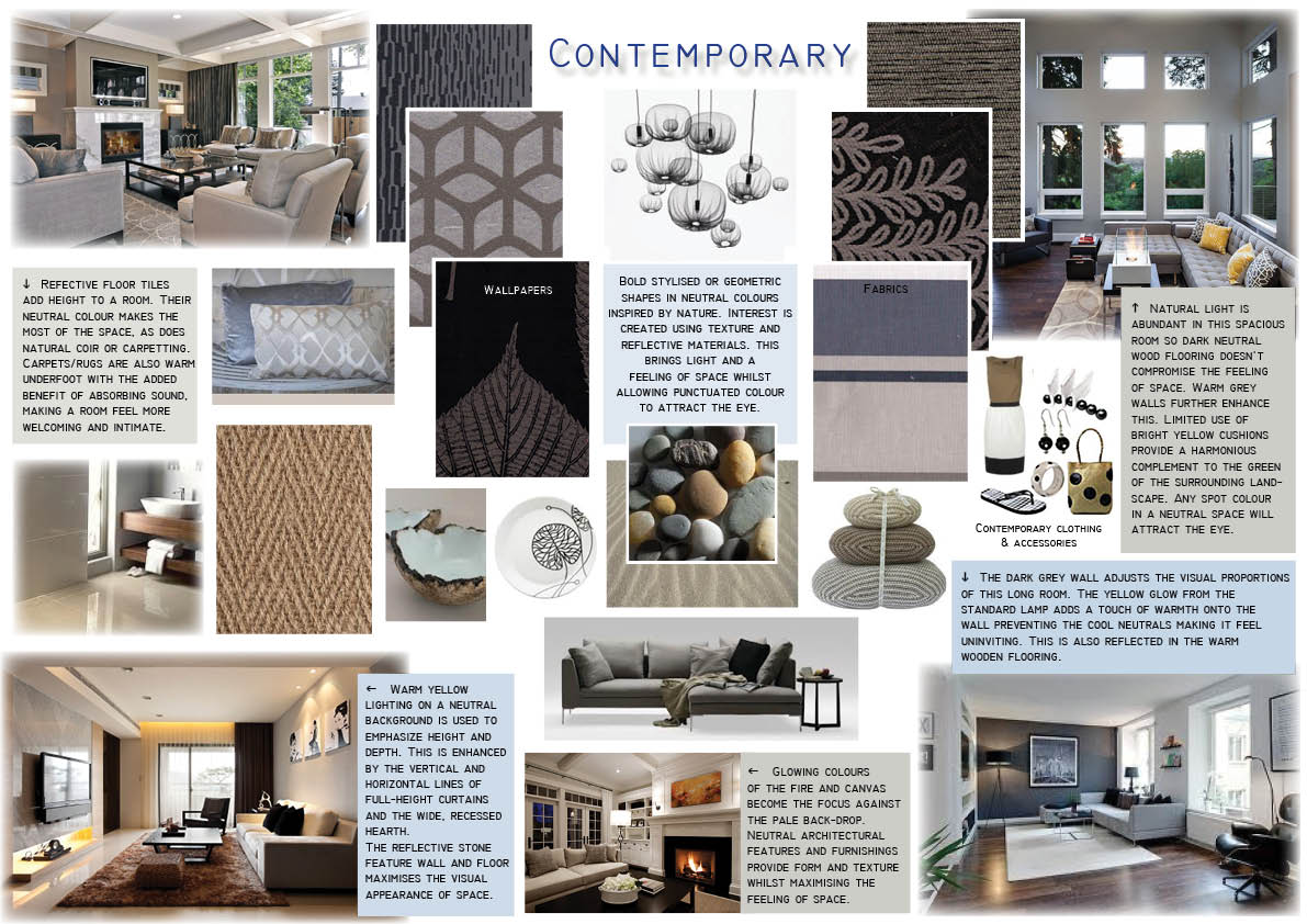
If strong colour doesn't work for you, use texture to create interest in a room. Look to nature for your inspiration using warm tones to make a room feel welcoming and calm.
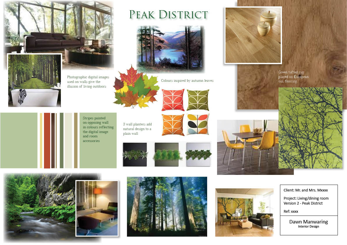
Photographic digital imagery for walls can be used to add an atmospheric connection to the natural world. Warm wood with contrasting greens are enhanced by vibrant autumnal red, orange and yellow. Use of wall planters can help to bring the outside in, if space is limited.
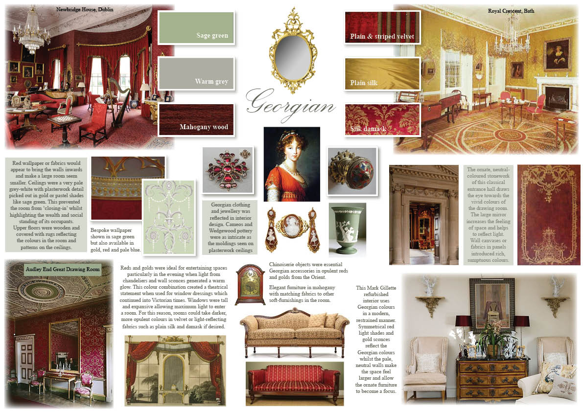
If you're looking for an authentic period feel, nothing says Georgian more than symmetry. For design inspiration, turn to stately homes where interior decoration was designed by the architect, creating a harmonious elegance which has stood the test of time. Using a pared-down neutral back-drop with striking, symmetrical accessories and accent colours, you can create a traditional feel in a more modest, contemporary setting.
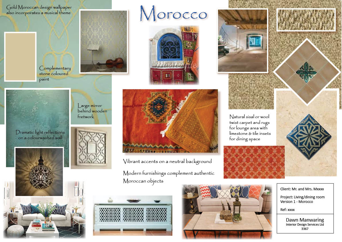
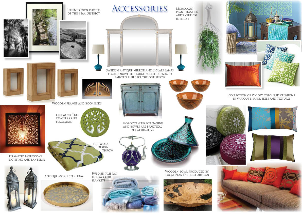
Fretwork, natural stone and warm colours reflecting the rich spices of Moroccan cuisine, conjure up an exotic atmosphere. Used with vibrant blue, a complimentary colour, you create a balanced, yet exciting space with a north African influence. Use dramatic, feature lighting on dimmer switches in the evening to experience a completely different ambience to the daytime.

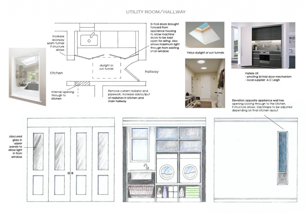
Room 1 of 3. Due to structural restrictions, this corridor to the kitchen and snug beyond, had several issues to overcome. Light was enhanced by inserting a skylight, aperture through to the kitchen and obscured glass to the bi-fold screen doors allowing natural light in from the window behind.
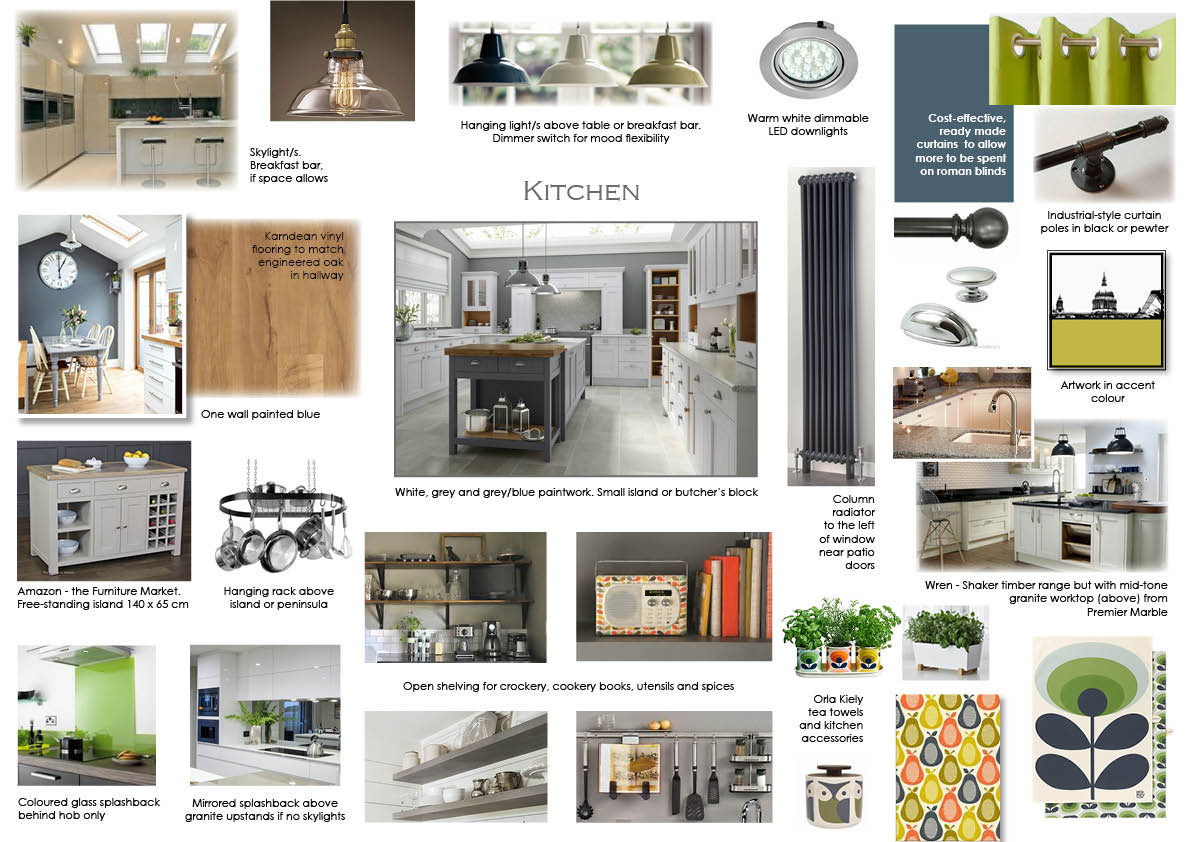
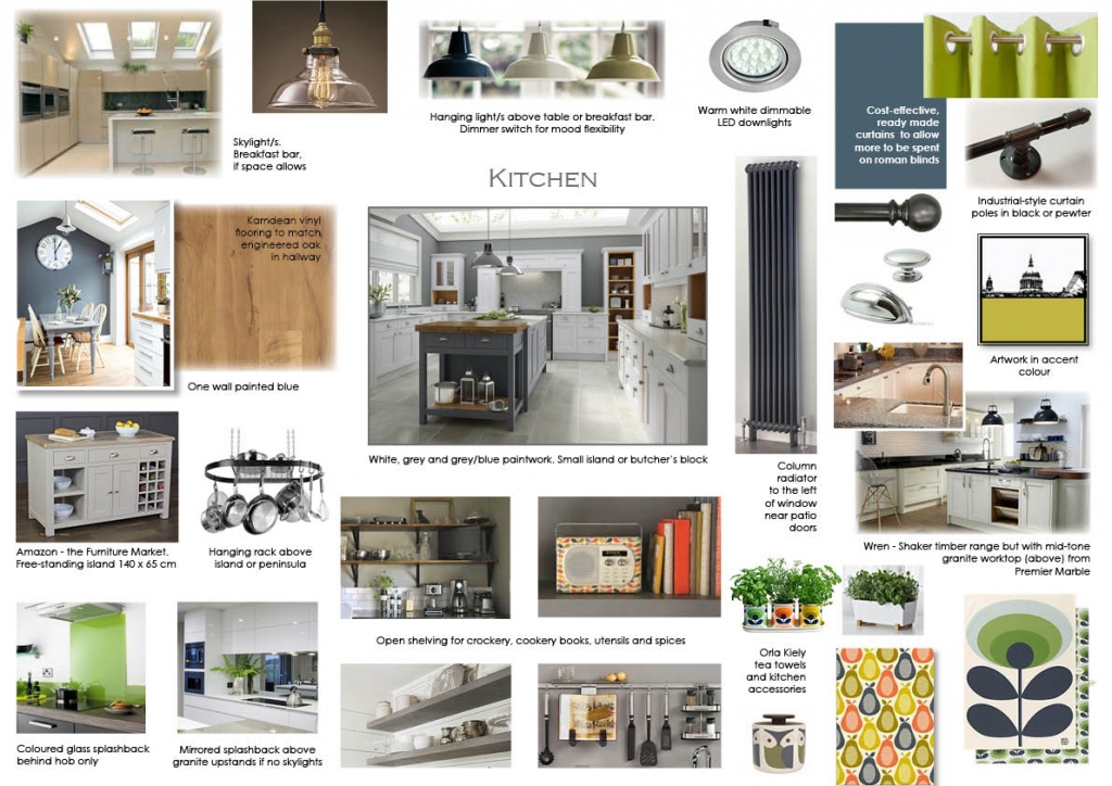
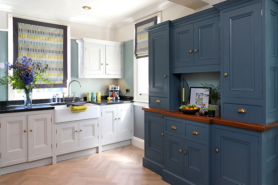
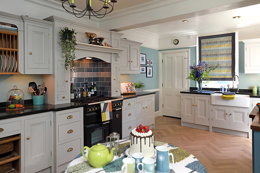
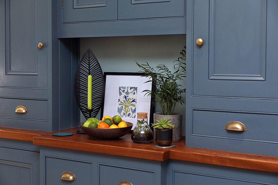
Room 2 of 3. The main kitchen had several functions to perform within a busy family home. Shaker style kitchen units were used for a timeless feel with accent design and colours kept to the accessories.
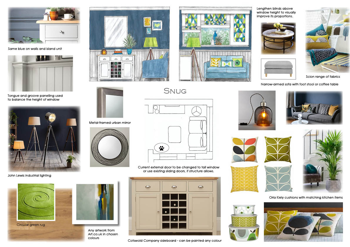
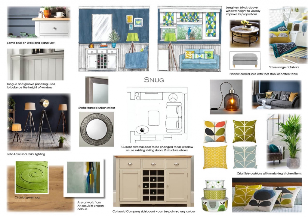
Room 3 of 3 - option 1. Client wanted to see a snug option for the former utility room. Colours were kept consistent throughout the 3 rooms.

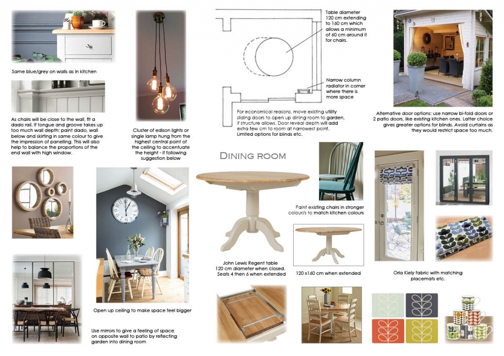
Room 3 of 3 - option 2. An informal dining room with access to the patio and garden were requested. As the room was small, I suggested raising the ceiling and using long flex lighting and plenty of feature mirrors to enhance the feeling of space.
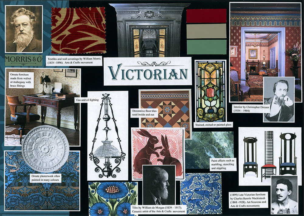
The Victorians had very lavish taste, favouring heavily patterned fabrics, stained glass, paint effects and rich colours. Later, the Arts & Craft movement created more simple, hand-crafted home furnishings. Victorian is a style that is still a firm favourite and has been hugely influential to designers over the years.
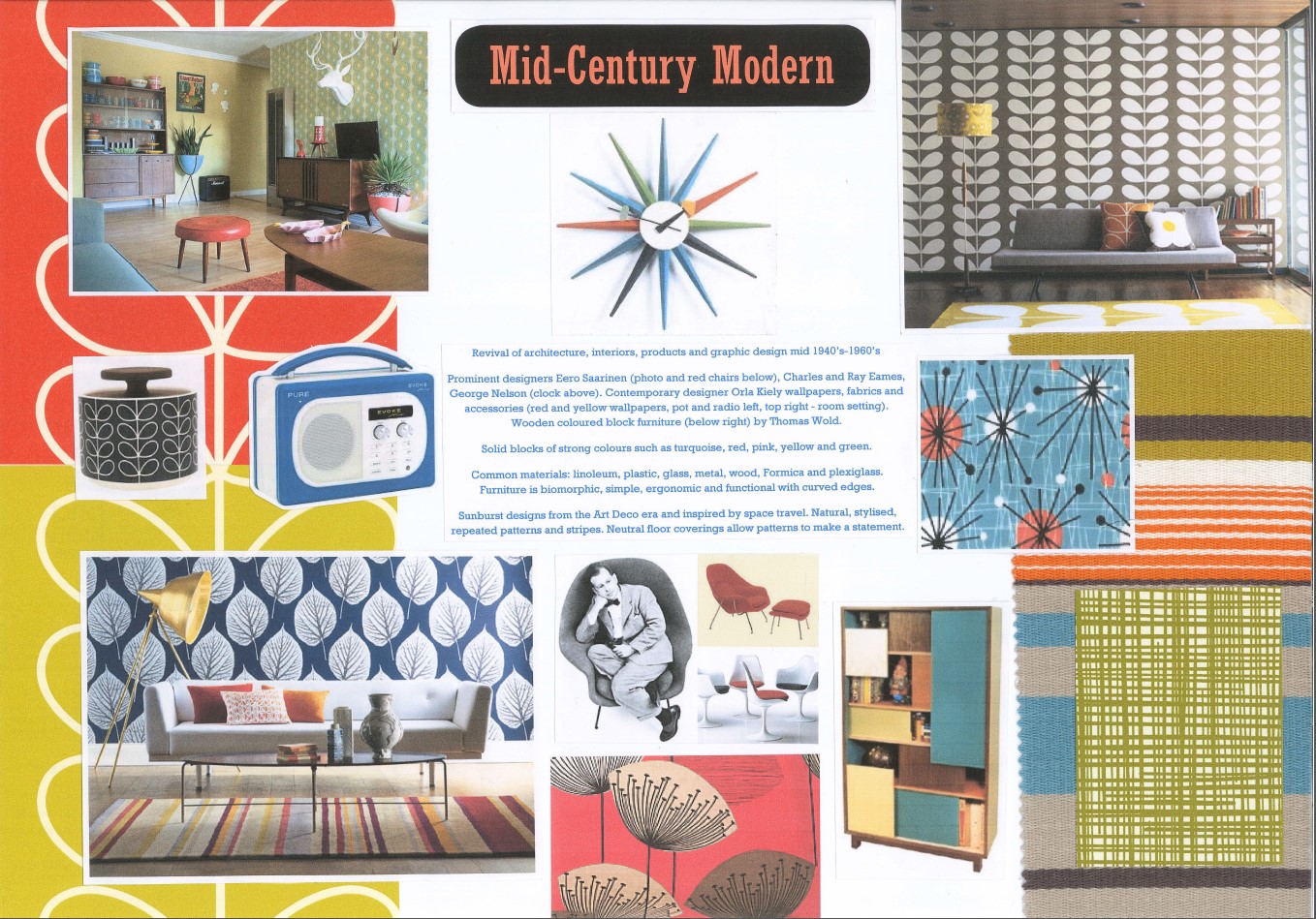
Mid-Century has regained popularity in recent years, with contemporary designers taking inspiration from its bold and colourful style. Iconic furniture and accessories are still reproduced today to cater for a demand for Retro design.
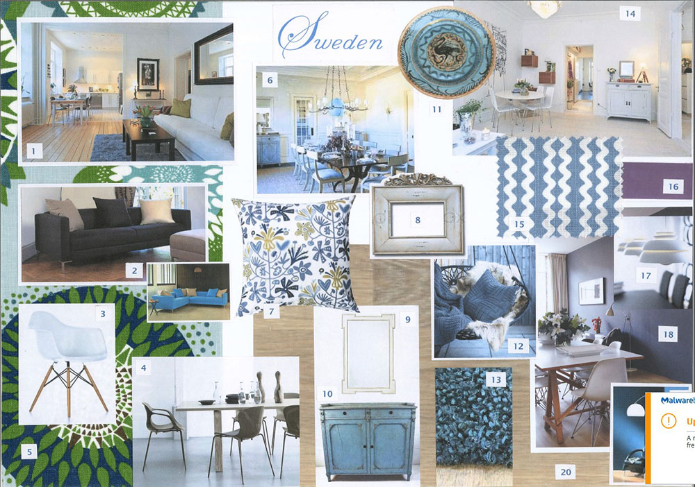
Scandinavian design (Scandi) represents minimalism, simplicity and functionality of five Nordic countries. Cool white is the dominant colour and design includes the use of natural materials such as leather, wood, wool and hemp. Highly patterned, coloured fabrics compliment the light, uncluttered look.
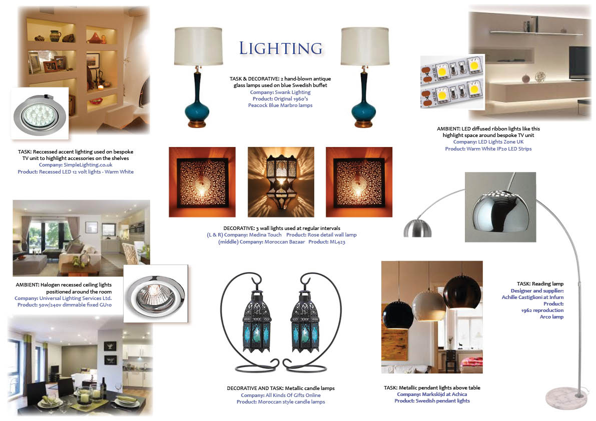
There are 3 common types of lighting: Ambient lighting - general lighting either natural or artificial. Task lighting - used for function or to highlight an object or area of a room. Decorative - more aesthetic but can also be functional. Consider using all 3 for flexibility at different times of the day.
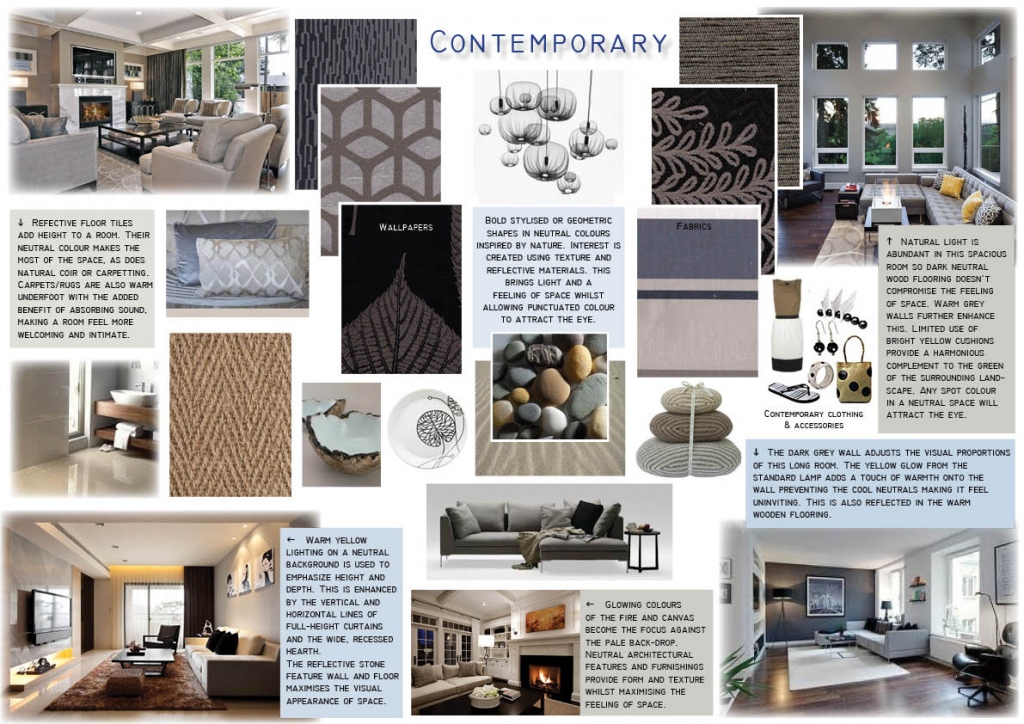




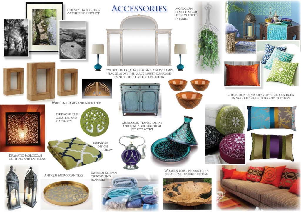
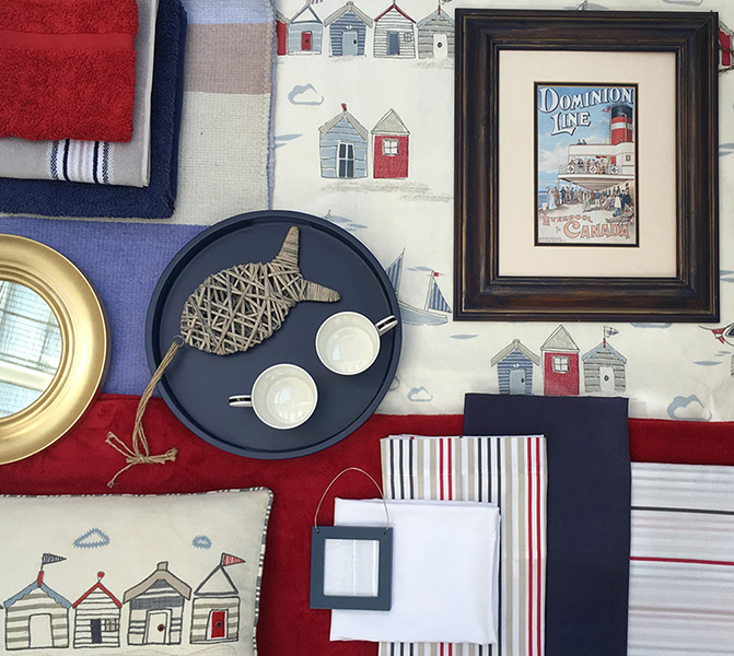
Photographs are of my own work. However, photographic images used in my design boards are not. They are used to illustrate a concept or design style alongside samples which I have collated and my own descriptive wording and sketches.

 '
'